Really not worth archiving. Really.

Monday, October 27, 2008 | Copyright © 2008 Frank Lynch. |


Home

Previous

Next

Archives

More on Flickr.

 
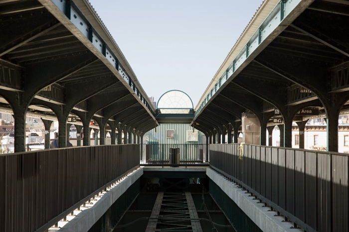
Two elevated subway platforms converge in the distance, but there's an imbalance between them.

Perfect symmetry is really difficult to achieve, and it's more difficult when the MTA varies its railings and has asymmetrical appurtenances on its buildings. And these people want to increase fares? Gimme a break. This is an M platform in Queens, at Myrtle-Wyckoff. Filed in Subways.

Photoblogs.org View My Profile


Me: Frank Lynch

Email:
frank dot lynch2 at verizon dot net